
Product Designer & Research Contractor
UX Design, Data Visualization, User research, User Interview, User Flow, Persona, Figma, Prototyping
7 months
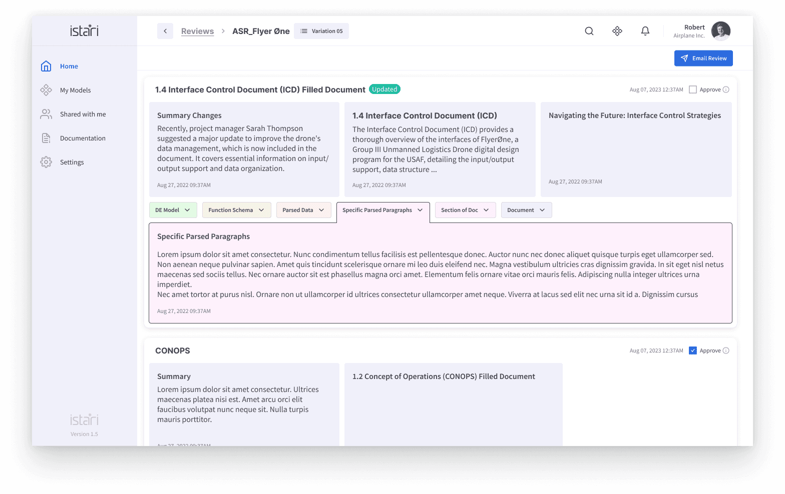
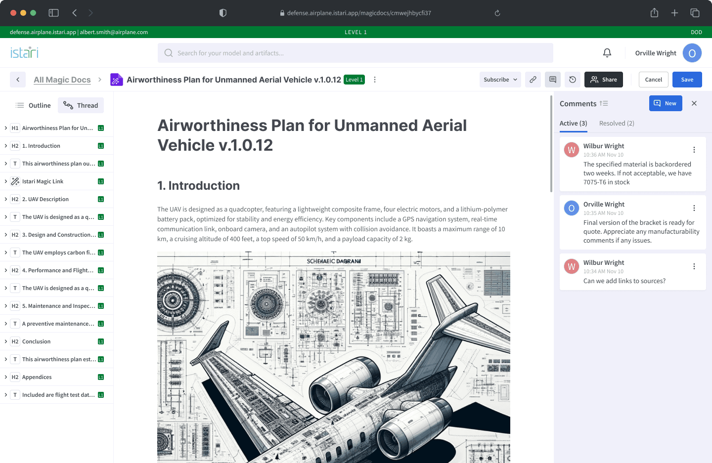
In industries reliant on CAD modeling and detailed project documentation, transferring data via emails and zip files created significant inefficiencies and risks, like broken links and version mismatches. These issues complicated collaboration between contractors with different licensing and access needs. The objective of "Istari" was to create a centralized, collaborative space where CAD models and associated data could be securely viewed and accessed in real time. The project’s mission was to provide a simplified, continuous documentation experience that kept reports linked to their original artifacts and accessible with clear, context-specific actions.
Discovery design for reporting format
Current Reality
Initially, project data was dispersed across multiple channels, mostly shared via emails, often in incompatible formats, causing fragmentation and manual reorganization. This workflow posed challenges for legal compliance, traceability, and project updates. Stakeholders faced delays due to broken links and formatting errors, making it difficult to achieve a synchronized understanding of project milestones. "Istari" addressed this by consolidating these elements into a single workspace, making collaboration smoother regardless of the tools and platforms different contractors used.
Define Design Goals and Structuring Reports
A critical design goal was to make report structures intuitive and ensure they remained dynamically linked to their original data sources. This required a layout that prioritized high-value information, with controls and CTAs clearly visible to guide the user’s next steps. Given the need for flexibility, the platform was built to transition seamlessly between commercial and federal tech stacks. Other design objectives included minimizing the cognitive load by organizing data access hierarchically and incorporating familiar collaboration patterns, such as those found in Google Docs, to enhance user familiarity while providing deeper data granularity for project stakeholders.
Refining Development
Development focused on creating a responsive interface that allowed easy navigation between CAD models, reports, and actionable items. Early builds were clunky, with users experiencing lag and occasional error messages for unsupported files. A core refinement was to introduce micro-interactions like keyboard shortcuts, error messages, and notifications to guide users. Enhancements also included smoother loading times and optimized links to maintain data continuity. This stage required rigorous adjustments to keep the system intuitive and reliable, aligning the technical framework with users’ needs in collaborative documentation.
Iterations and Testing
Due to limited user testing opportunities in the pre-seed phase, the design team relied heavily on internal QA and feedback from select early clients, using rapid testing sessions to iterate on core functionality. Testing focused on how users interacted with linked data, responded to notifications, and navigated version control. Minor UX improvements—such as improving message clarity, incorporating error handling, and speeding up report loading—gradually shifted client perceptions and increased enthusiasm for the platform. Feedback gathered from these rounds was invaluable for identifying and refining the product’s fit within its target market, even in the absence of comprehensive data.
Iterate and Test for Usability and Value
Tested the design with users to ensure it provided clarity without excessive information, streamlined runbook usage tracking, and allowed quick decision-making based on data. Integrated user feedback to refine the interface and ensure it met the needs for both high-level insights and detailed exploration.